
How to Choose Art Colours That Complement Your Home Interior
When you are decorating a room, choosing the right colours for your walls is one of the easiest ways to pull a whole space together and give it the lift it has been missing.
Many people hesitate when buying artwork because they worry about choosing a piece that ‘doesn’t go’ with their sofa, curtains, or paintwork. The good news is that you don’t need to match your art to your cushions like a paint swatch. In fact, the most memorable rooms rarely match everything too neatly.
Whether you want to create a calm, restful sanctuary or add a rich focal point that draws compliments the moment guests walk in, here is a simple, practical guide to choosing art colours that feel right at home.
1. Decide on the Mood First
Before looking at specific colours, think about how you want the room to feel when you spend time in it:
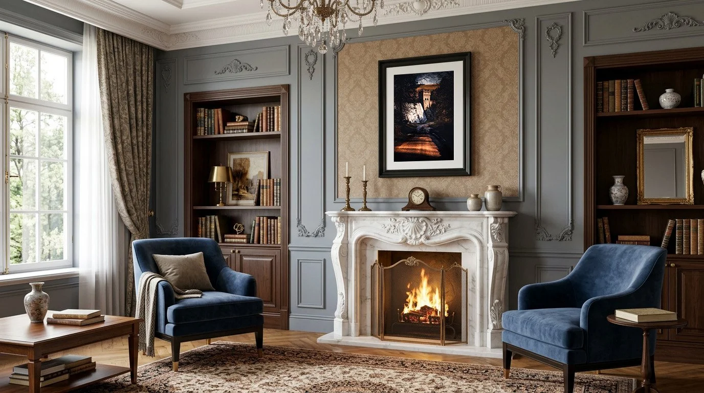
Warm & Inviting (Golds, Ambers, Deep Reds, Earthy Browns): Ideal for living rooms, dining spaces, and cosy snugs. Warm tones naturally draw people in and make larger rooms feel welcoming. Especially during darker autumn and winter evenings.
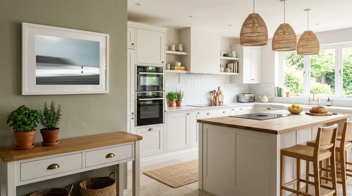
Calm & Grounding (Soft Greens, Slate Blues, Muted Greys): Wonderful for bedrooms, studies, and quiet reading corners. Colours drawn from nature help a room feel spacious, peaceful, and unhurried.
Bold & Expressive (Rich Contrasts, Dramatic Shadows, Vibrant Accents): Brilliant for hallways, open-plan kitchens, or neutral rooms that need a striking centrepiece to spark conversation.
2. Three Simple Approaches to Matching Your Room
The "Pull-Through" Method (Effortless Harmony)
Look around your room and pick out one secondary colour that already exists in a smaller detail—such as the warm tone of an oak sideboard, the brass on a lamp, a terracotta pot, or a subtle thread in a rug. Choosing an artwork that echoes that single tone immediately makes the piece look like it belongs in the room, without feeling overly coordinated.
Warming Up Neutral Walls
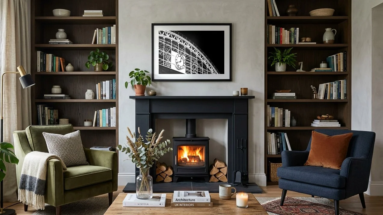
Many UK homes feature lovely neutral backdrops—soft greys, warm whites, greige, or pale stone. While clean and versatile, neutral walls can sometimes feel a little flat on their own. Hanging a print rich in warm amber, golden light, or deep woodland tones brings instant depth and personality without needing to repaint a single wall.
Creating Gentle Contrast on Dark Walls
Deep navy, forest green, and charcoal walls have become hugely popular in British interiors. Against a rich, dark backdrop, artwork with luminous highlights, soft natural light, or warm golden tones really glows—turning the print into a true showstopper rather than letting it fade into the background.
3. Don’t Forget the Frame & Mount
The frame you choose acts as a bridge between your artwork and your room’s existing furniture:
Natural Oak or Warm Wood: Softens strong colours and pairs beautifully with cosy, traditional, or country-inspired interiors.
Matt Black or Dark Charcoal: Adds crisp definition and modern structure—especially effective with dramatic landscapes or urban scenes.
Classic White or Off-White: Keeps things light, airy, and timeless, letting the colours inside the print take centre stage.
Using a White Mount (Mat Board): Every print in my collection includes a subtle white border, and adding a wider off-white mount inside your frame gives the artwork breathing room—preventing strong wall colours from competing with the image.
4. Trust What Draws Your Eye
Interior rules are helpful starting points, but the best piece of art for your home is always the one you genuinely love looking at every day. If a particular scene or colour palette stops you in your tracks, chances are it already reflects your personal taste—and that authenticity is what gives a home real character.
Explore Artwork by Mood & Palette
Every print in my Fine Art for the Home collection is individually colour-managed and personally inspected in my Greater Manchester studio to ensure rich, true-to-life tones on archival fine art paper—with free UK delivery on every order.
[Browse Landscape & Nature Prints →] (Link to Landscape section) — Earthy greens, soft morning light, and grounding natural tones.
[Browse Urban & Street Prints →] (Link to Urban section) — Warm evening glow, rich shadows, and atmospheric city colour.
[Browse Abstract & Impressionistic Prints →] (Link to Abstract section) — Expressive palettes, painterly movement, and bold focal points.
Unsure how a particular print will sit alongside your wall colour or furniture? Get in touch with a quick photo of your room—I’m always happy to offer a second opinion or show you how a piece will look in your space.